Recognizing your progress is essential. At times, it may seem like you're endlessly drawing without seeing improvement in your skill level. However, by comparing two drawings—one from now and one from a year ago—you'll immediately notice the changes. Allow me to showcase a few examples from my students where the results speak volumes. As I love to say: “Practice makes progress“.
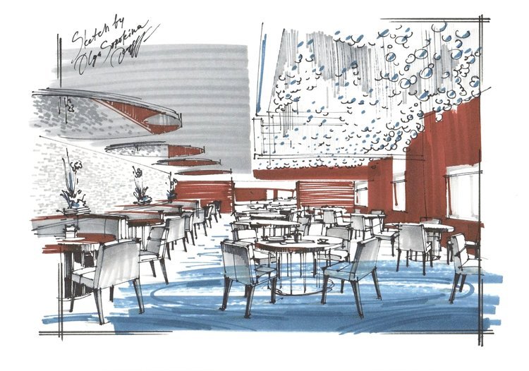
1 Example
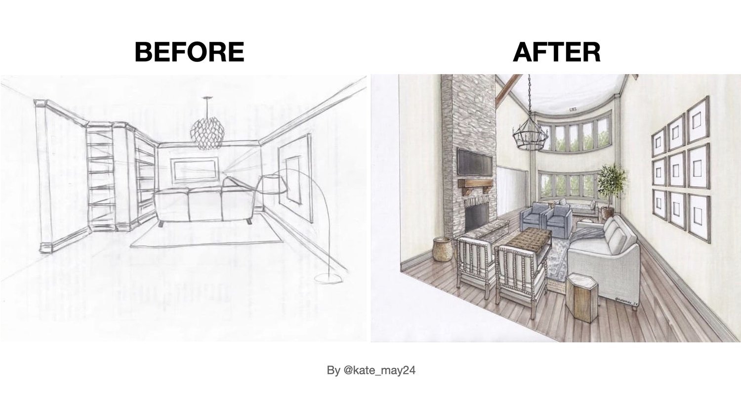
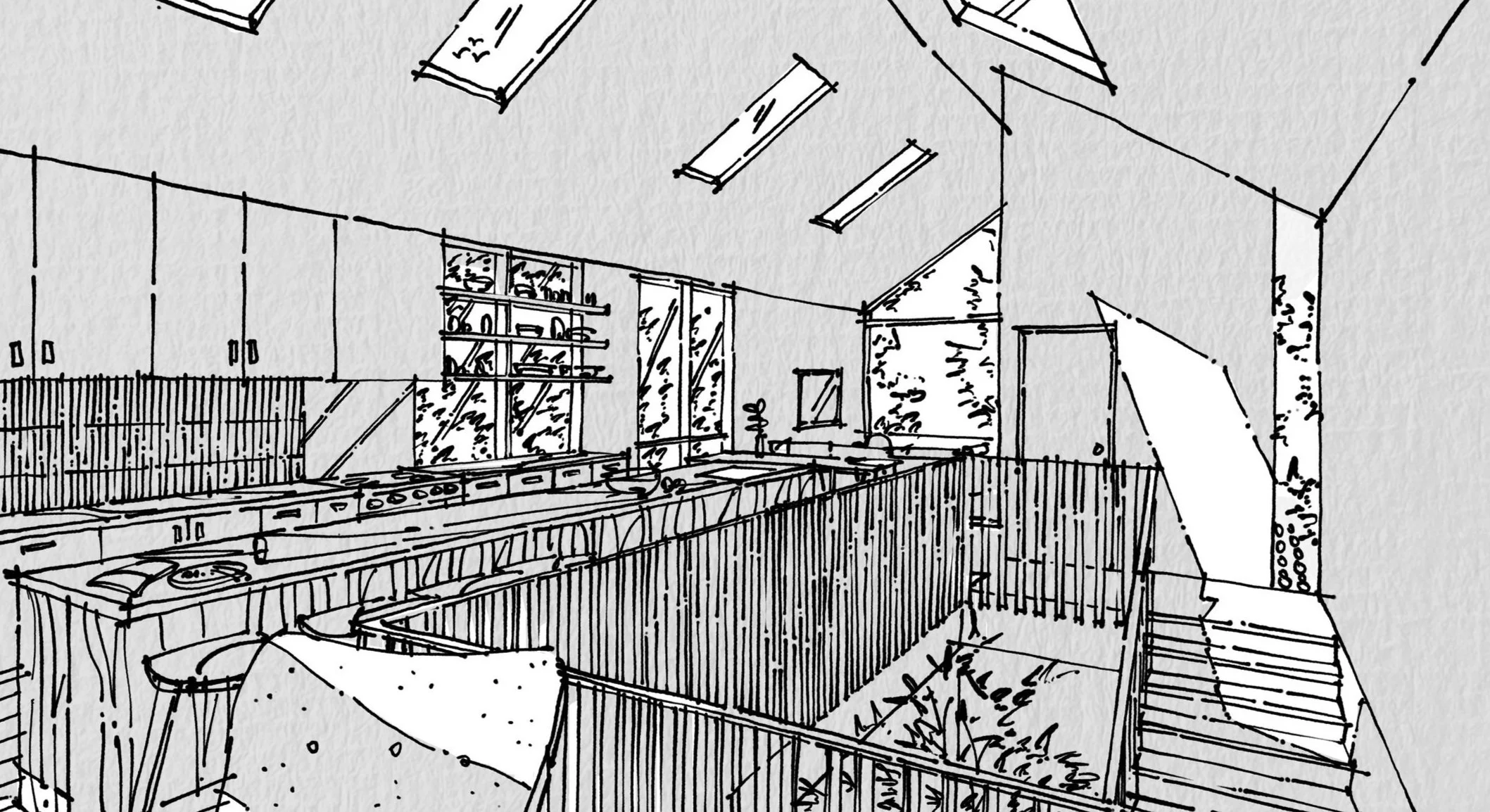
Take a glance at the sketches by my student, Kate, before and after enrolling in my courses. The transformation is remarkable, wouldn't you agree? We witness not only a mastery of perspective but also a skillful depiction of textures and an impressive presentation of interior design ideas. Kate successfully completed the comprehensive “BASE+PRO“ Bundle at my Online School.

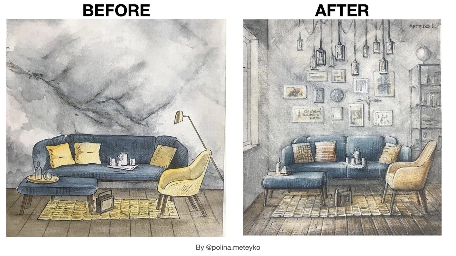
2 Example
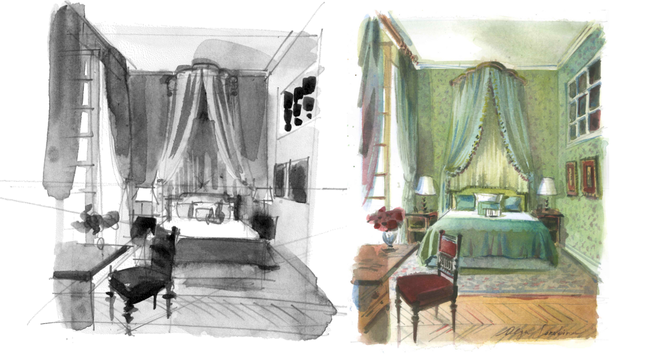
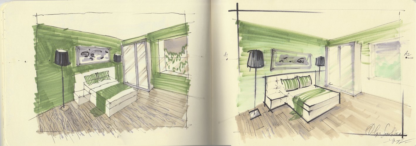
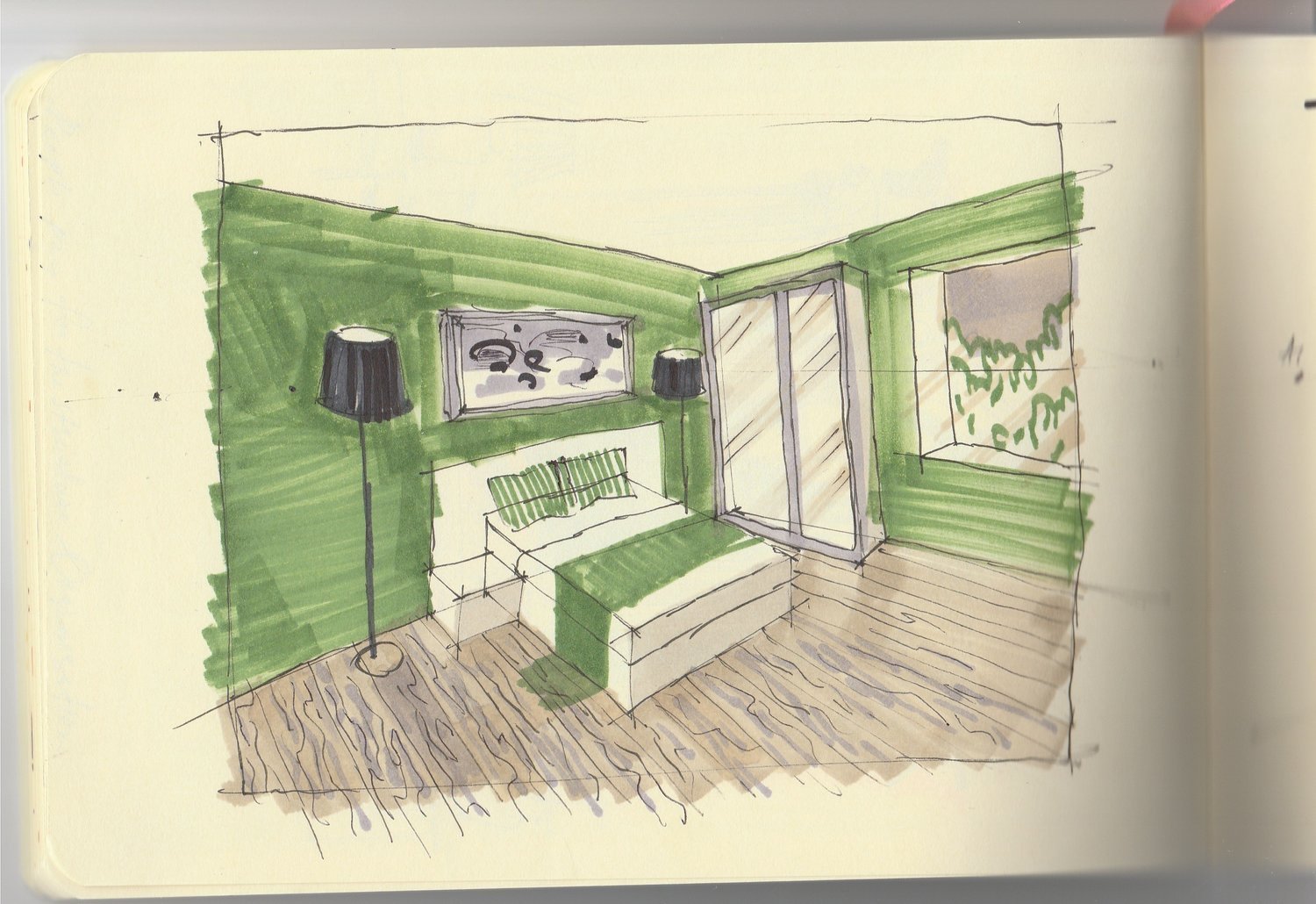
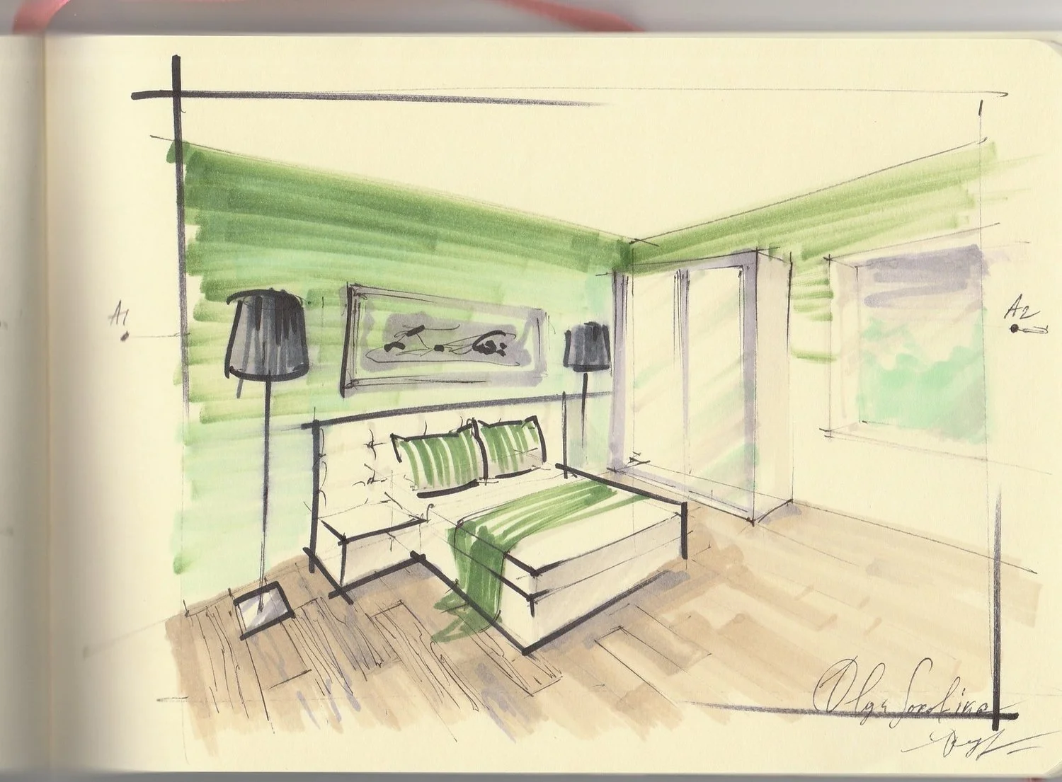
Similarly, observe the watercolor works of another student, Polina. Post-course completion, Polina's drawings exhibit enhanced detail and professional rendering. Polina diligently completed all of my interior sketching courses, including WATERCOLOR, BASE+PRO, TEXTURES.
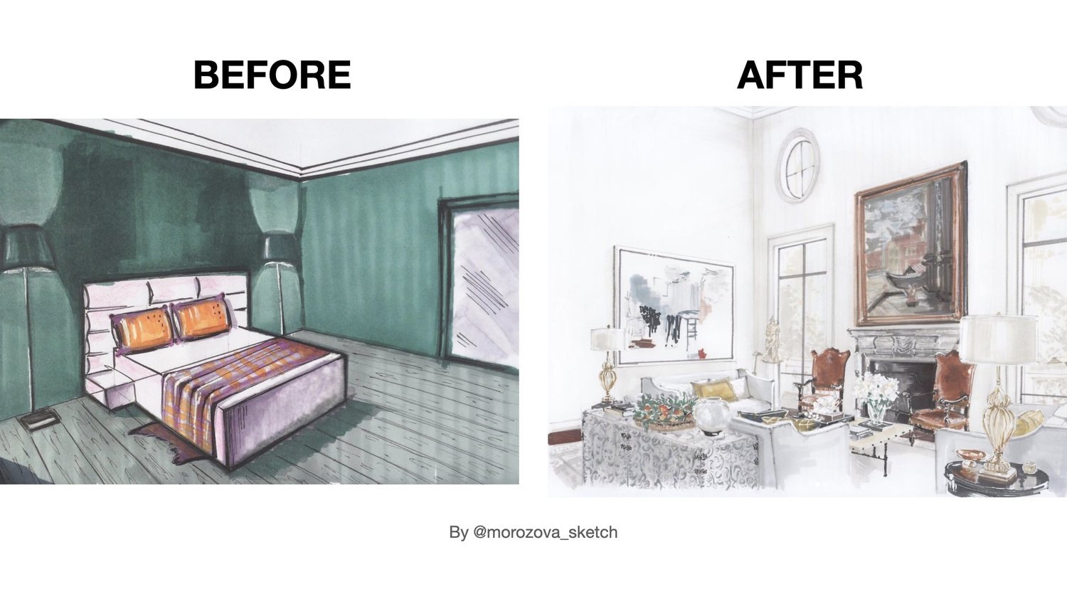
3 Example
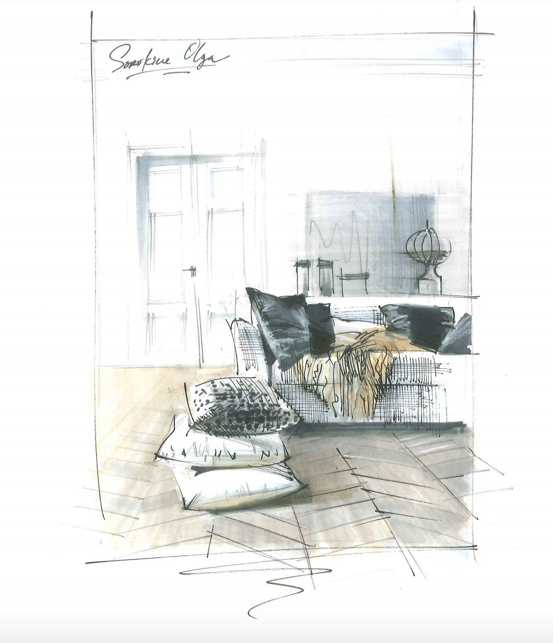
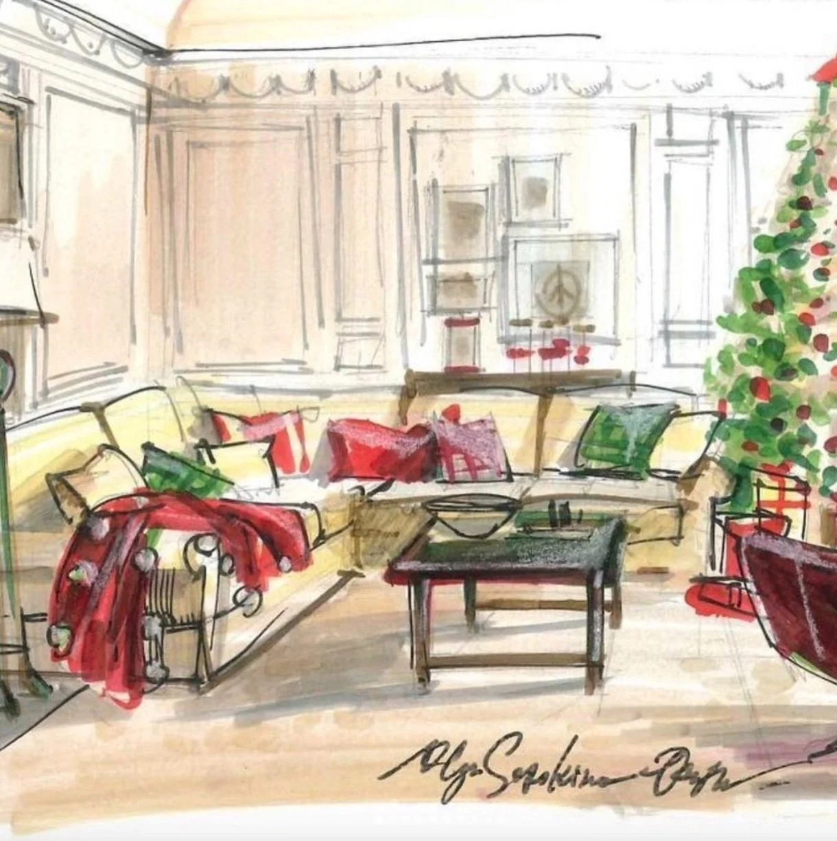
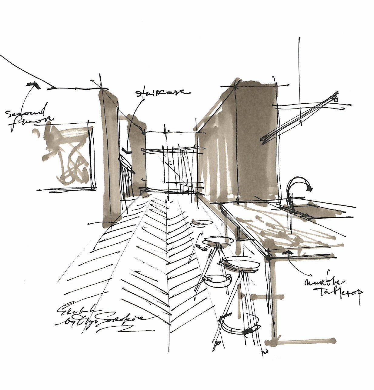
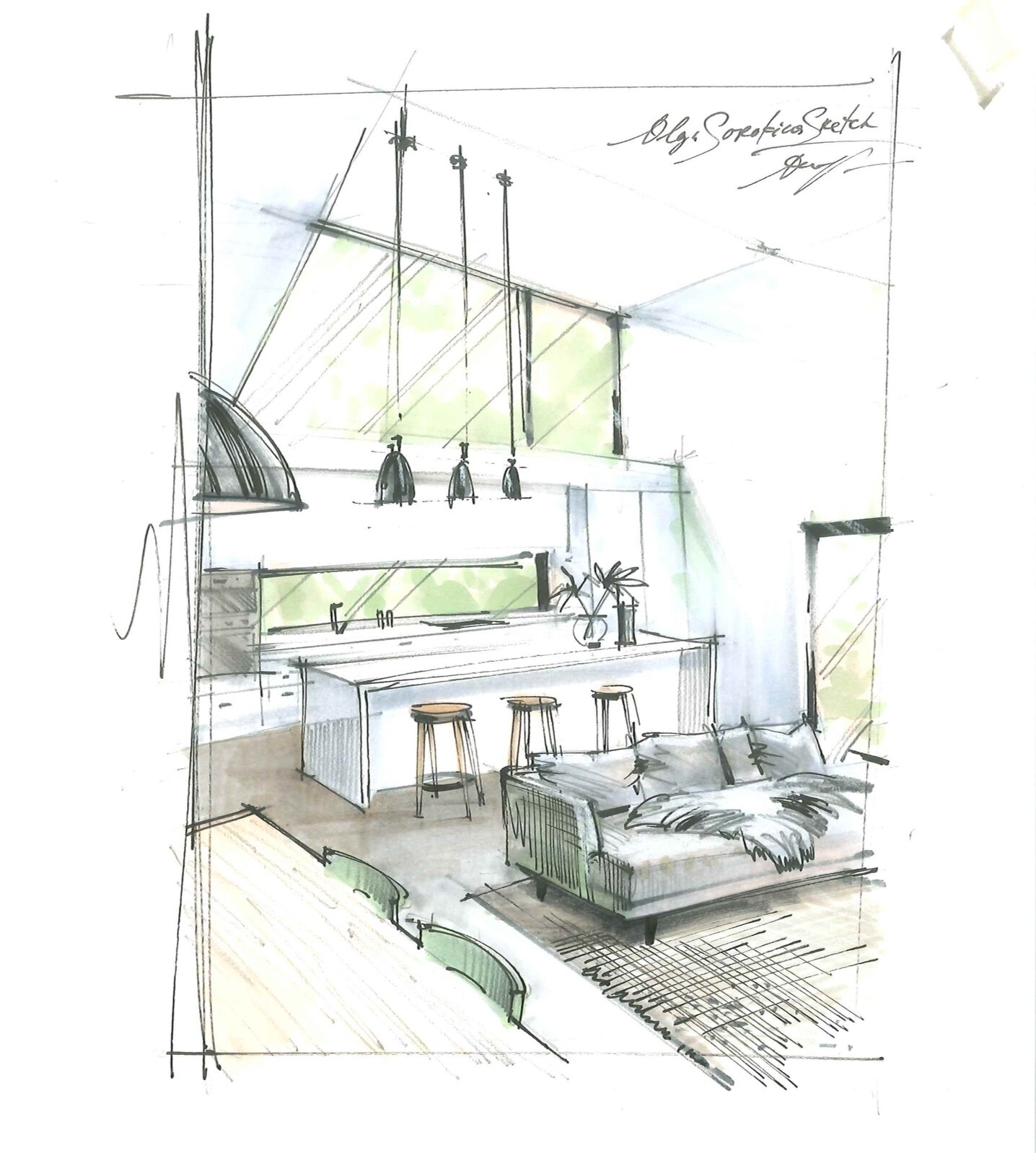
In the "BEFORE" photo, you'll find Anastasia's very first interior sketch from my perspective challenge. Following her completion of courses in interior sketching (BASE+PRO, TEXTURES) witness the breathtaking "AFTER" result! It's worth noting that Anastasia's professional background lies in land surveying, without any formal training in the arts. Yet, her dedication and the guidance from my courses propelled her into a successful sketch artist.
“Practice makes progress”
In each of these instances, my students transitioned into full-time freelance sketch artists, securing interior sketch commissions. It's inspiring to note that even with completion of just the "BASE" course, many students began receiving their first sketch commissions. This demonstrates that achieving success in this field is within reach for anyone.
For further inspiration, explore more sketches crafted by my students on Instagram using the hashtag #SorokinaStudents
Join hundreds of designers who are currently taking my Interior Sketching course.
"BASE": a Course Which Teaches All the Basic Techniques You Need to Implement Sketching in Your Interior Design Practice
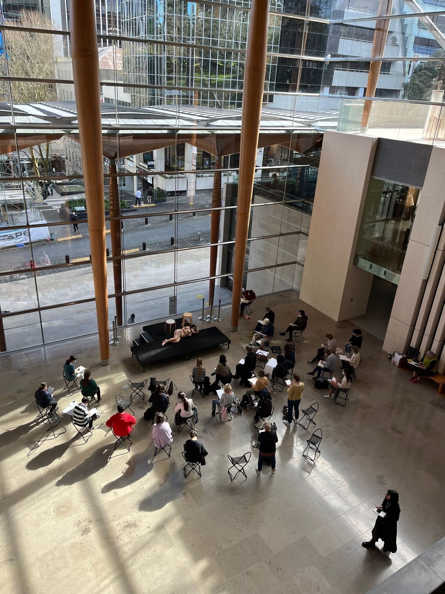
Related blog article: Open Day at Olga’s Online School of Sketching
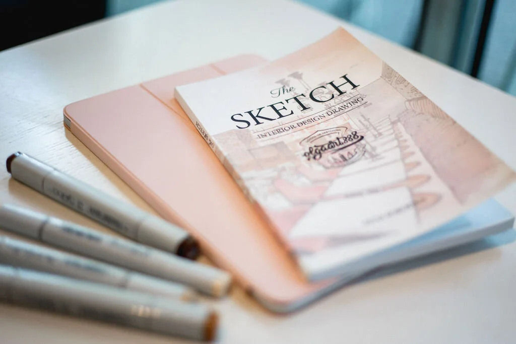
DO YOU WANT TO IMPROVE YOUR SKETCHING LEVEL?
See the program of my online courses: here
HAVE A QUESTION?
Email me at olga@schoolofsketching.com
Read more from my blog: