

After more than 6 years of teaching interior sketching, I can tell you that I notice the top 10 common mistakes that beginners make that can ruin their sketches, and I’d like to teach you how to avoid every single one of them.
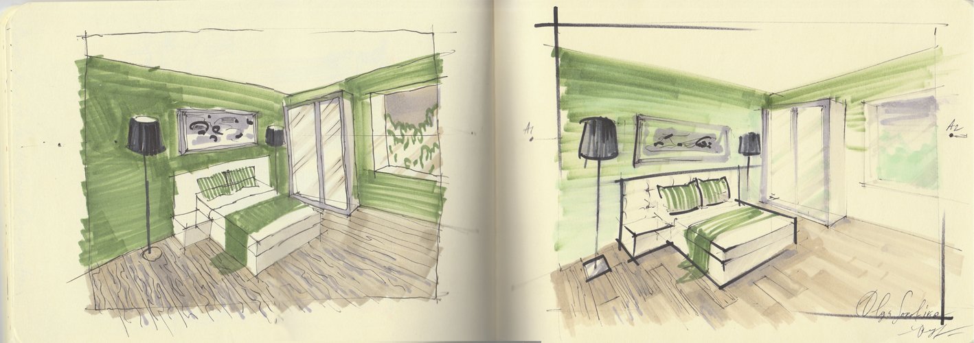
Please take a look at the image below. This is a drawing that I created specifically for this article to illustrate all of the ideas I’m about to share. Sketch to the right is OK; sketch to the left contains all of those 10 mistakes. Surprised? Keep reading and learn more.
I’ve been teaching interior sketching and perspective drawing since 2014, and I can tell you that I can see certain mistakes that not only beginners in sketching but also experienced interior designers make in theirs drawings. These mistakes compromise their professionalism, and I’d love to teach you how to avoid them in this article.
These are basic and very common mistakes that not only beginners in sketching but also interior designers make. Unfortunately, these mistakes can make your sketch look flat and unprofessional or even jeopardize your reputation as a designer.
As a bonus, at the end of this article, I will share my Top 5 free tips for detecting and fixing your mistakes and the biggest secret of interior sketching.

Olga Sorokina
Top 10 mistakes in interior sketching:
Mistake #1: "I like everything equally"
That is when you draw all the elements in your sketch equally detailed and with due diligence. You can thoroughly draw the things that are farther away just as carefully as the foreground objects. And this is a big mistake in interior sketching, as this approach neglects the aerial perspective, and, consequently, the sense of space and air in the sketch is missing. Such drawings can often look plain, "tortured", and overloaded.
Mistake #2: "Focusing on details"
It is especially typical for girls. We can depict, for instance, the texture of velvet with markers so perfectly that it seems realistic. Meanwhile, all the proportions in the drawing go wrong, the composition is far from perfect, and the perspective is completely distorted. But we stubbornly refuse to see the overall picture and continue to draw beautiful copper rivets on the back of our velvet chair.
Mistake #3: "I don't get along with Her Majesty Perspective"
I have already mentioned the critical importance of proper perspective in sketching in my "10 Rules of Sketching", where it even takes the first place.
Distorted perspective works well only for cubists, while in interior sketching, you must know its basics (at least frontal and angular ones) "like the back of your hand". Look here, the lines of the bed, closet, and walls in the "wrong" sketch now converge at some completely different vanishing points, while all the lines in the "right" sketch converge at the vanishing point either on the left (A1) or on the right (A2), or they are just vertical to the heights of the objects.
In interior sketching, everything depends on the fidelity of construction, so if you were good at perspective and shadow projections at school, it is a great virtue. But if you did not like or study it, I invite you to my free challenge on the basics of perspective for interior designers available here: click.
Please, analyze how the ovals open towards the horizon line in the scene. You can compare the lampshade ovals in both sketches.
In addition, keep an eye out for perspective reduction, as shown in the sketch by the cushions and the middle of the cabinet: the farther the object is, the smaller or narrower it should be.
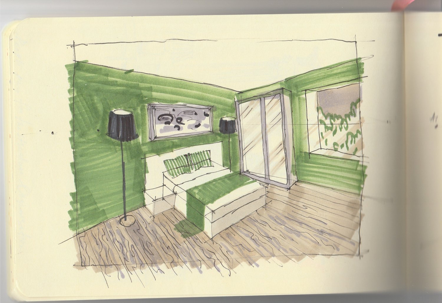
“Wrong“ sketch with all 10 mistakes in it
Mistake #4: "Drawing on the wrong side of the marker paper without realizing it"
It is a purely technical mistake that is very easy to avoid. Before you start drawing another sketch, try to draw a line with a light gray or any soft beige marker somewhere on the side of the sheet and immediately run your finger over it. If the paint gets smeared, this is the wrong side of the marker paper; if the color is absorbed instantly without being smeared, this is the right side. Why is it so? Manufacturers of marker paper put a special coating on one of the sides, which keeps the marker from seeping through that paper and, thus, saves the consumption of the markers themselves.
Mistake #5: "I'm so terrible at this, please, go easy on me, it's my first time”
This mistake lies in the person's approach to learning new things. And who managed to create something brilliant for the first time? Perhaps it could be Pushkin or Mozart. Oh, how often have I heard that phrase, particularly, by the way, when I held a marathon on the basics of perspective for designers (Instagram hashtag #marafon_olgaart888). Guys, but where is this coming from?! It is so great that you decided to learn something new and were not afraid to "take your first lumps". In such cases, you have to encourage yourself and realize that you'll certainly succeed in it, but not immediately. Far from “immediately”. Be persistent and keep learning.
Mistake #6: "Drawing with ragged lines"
It's a very common mistake. Because of insecurity, the hand trembles, the pencil barely touches the paper making the outline of objects broken, with one long line made up of dozens of shorter ones if you take a closer look. Such sketches just scream: "I'm not a confident sketch! I was drawn by a beginner with a fear of drawing!" What should you do? Develop your skills. This 10-minute video on hand placement exercises can be useful to you: watch.
Have you ever noticed how kids are drawing? They press down very hard on the pencil and draw confident, albeit curved, lines. They're the ones you can learn from for being fearless in learning new things!
Mistake #7: "Applying marker inappropriately"
For the interior sketch to look more realistic, the marker (or any other material, such as a pencil or crayon) should be applied "in shape". For example, in the "right" sketch, the green marker is applied to the walls as if each line tends to a vanishing point (A1 or A2). In the "wrong" sketch, the marker is "hit or miss" which immediately makes the sketch look cut-out, collage, and unnatural. This mistake of hatching "at sixes and sevens" or "in a straw-witted manner" is one of the most common ones made by beginners, many of whom have not yet learned the advantages of a wide marker tip and fail to use its strengths hatching large areas of the drawing with a thin tip.
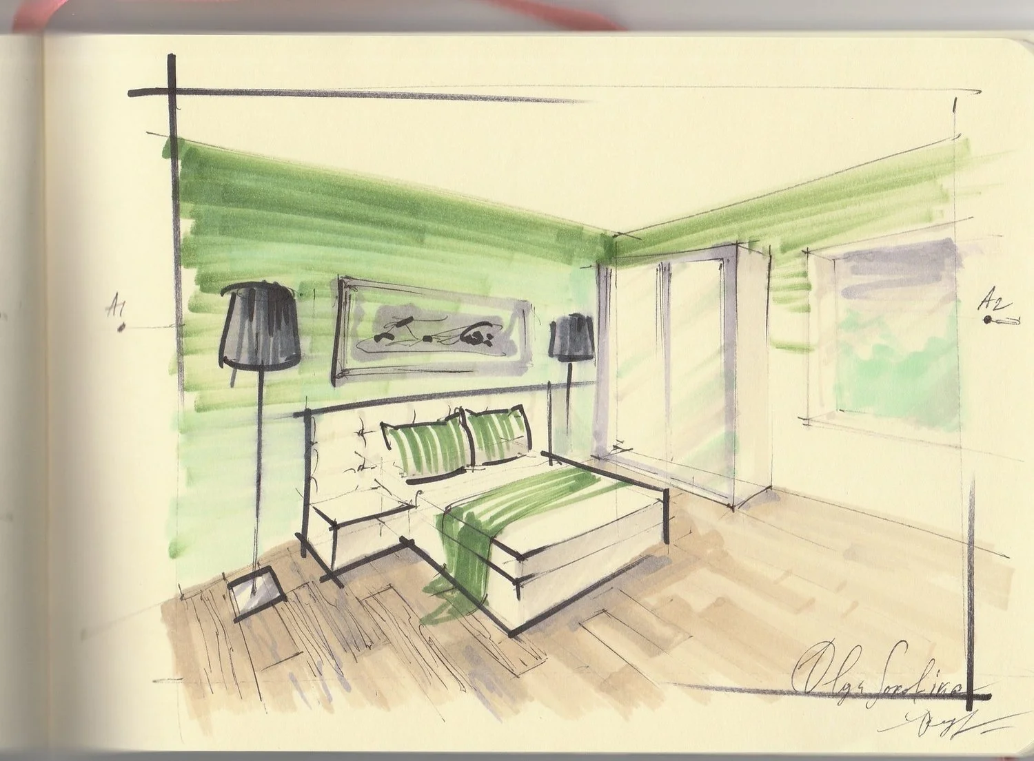
“Right“ sketch without those mistakes
Mistake #8: "Oops, some problems with textures"
A common problem for beginners in sketching is having difficulty rendering textures (especially wood, glass, and stone): they either work too intensely in this case, ignoring the source and relying on their imagination or depict the texture pattern out of scale, usually by making it very large (see my "wrong" drawing for the parquet as an example: I have depicted a too large wood pattern for this room, in comparison to the "right" drawing). In addition, beginners often draw textures that look unrealistic. For example, a person wants to depict a tree, but it looks more like marble veins or even "ragged worms". In such cases, it's necessary to develop observation skills, do some research on the Internet, and get inspiration. It's essential to have a visual experience. So instead of taking textures from your head and drawing using your imagination at the beginning, use pictures (Pinterest is a good choice) as they can be really helpful. You can find the most popular textures in interior sketching here.
Mistake #9: "The view outside the window in the drawing seems more important than the drawing itself"
If there is a window in the sketch, newbies often start to draw actively the crown of trees using a bright grass color marker so that when someone looks at the drawing, they see nothing but "garish" trees. In such cases, we should remember that what's outside the window is in the far-far background, and in our sketch, we must focus on the foreground subjects. In addition, the thickness of the air outside the window softens all colors and makes them translucent, pale, with a cold grey shade.
Mistake #10: "Your tonality fades: everything is equally grey"
Here it is required to highlight the lightest, darkest, and most middle objects according to the tone in the sketch. It is called "tonal parsing" of the sketch. In this case, it is advisable to train on the monochrome sketches, for example, the ones which are drawn exclusively with grey markers (you can just use three of them: light gray, medium gray, and dark gray). Thus, you will get used to distinguishing the tonality of the scene, for example, a color drawing can turn out bright, all markers will have different colors but the same tone, and as a result, there will be no contrast in the drawing, as if everything is blended into a single spot.
What should you do?
Here are my Top 5 free tips for detecting and fixing your mistakes:
1) A good idea is to print out your sketch in shades of grey using only a black cartridge and see if you have this problem. If yes, everything will be equally gray on the printout.
2) You can also take a photo of your sketch and judge the result, as this mistake is pretty visible in the pictures in a small format.
3) You can stand in front of the mirror with your sketch, and the reflection always reveals mistakes better.
4) Alternatively, you can turn the sketch upside down. The thing is to change the point or angle of view at the sketch since while you are drawing, your eyes "get blurry", and you become blind to your mistakes, repeating them from one sketch to another.
5) You can squint and look at your sketch, and if everything looks like one single spot, equal in tone, then it's high time you fixed the situation.
By the way, these five tips will work for almost all mistakes since it's just easier to notice them using these techniques.
The biggest secret
Top secret of interior sketching revealed…
The moment you know about all those mistakes, guess what? You can break them!
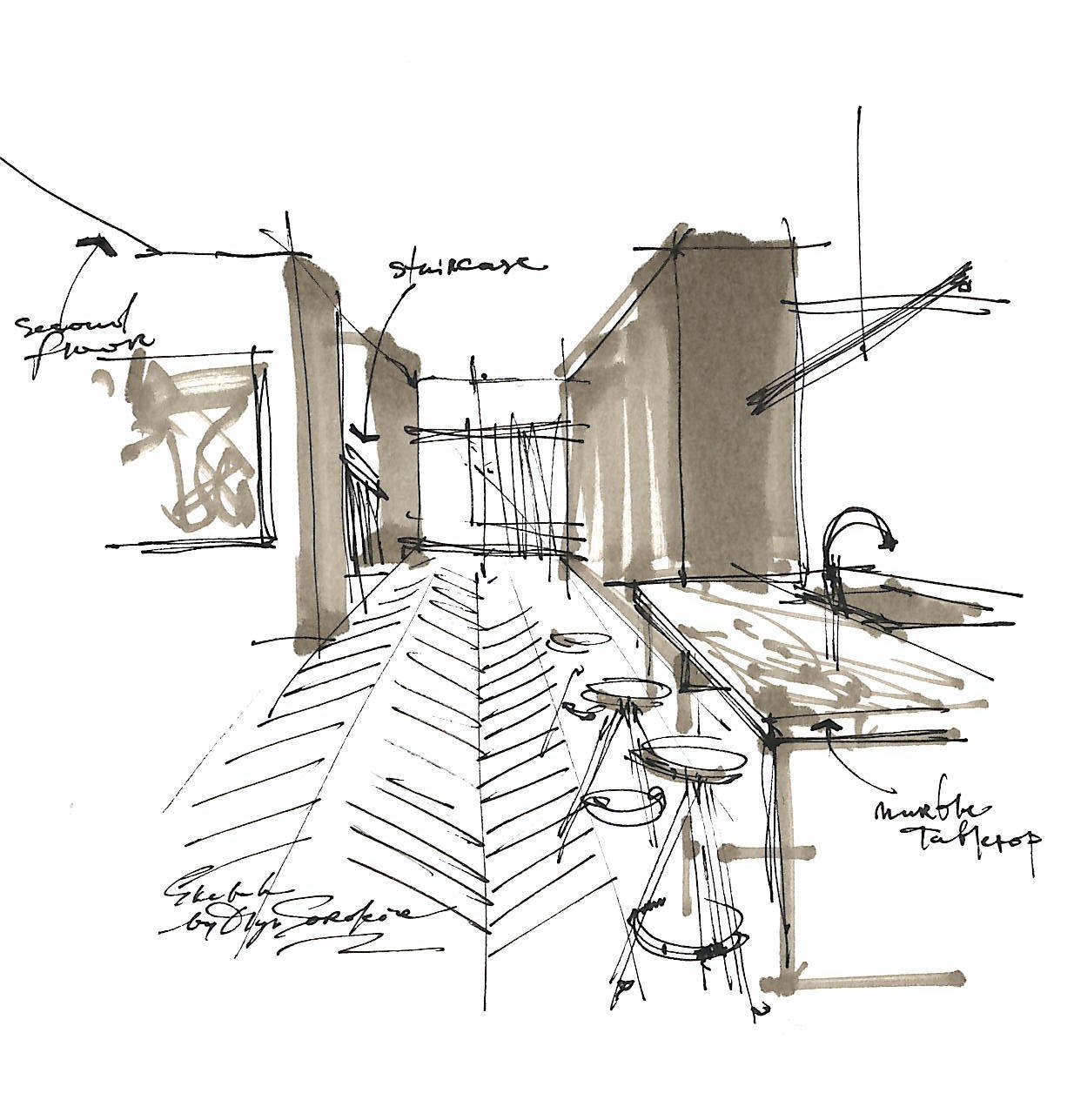
Take a look at my sketch above. It took me about 5 min to make it; I was drawing almost unconsciously while knowing that I was breaking the rules of perspective. If you take a closer look, you might notice that the convergence lines do not meet in one vanishing point, which would be correct. This is more of a freestyle sketch to quickly express an idea.
“Learn the rules like a pro, so you can break them like an artist.”
Finally, one more piece of advice:
Try to gradually move away from the ruler and eraser and focus on drawing by hand. You should train your hand, while the ruler and eraser are like "crutches" you get used to very quickly and develop a habit of constantly drawing with the ruler. Hand sketches look incomparably more attractive, professional, and lively.
What was your biggest take-away from this blog?
Did you notice any of these mistakes in your sketches?
Let me know in the comments below.
P.S. If you enjoyed this article, please share it, that would mean the world to me.
© Olga Sorokina
Check this video, where I go over 7 of those mistakes which I mentioned here:
SUBSCRIBE TO MY NEWSLETTER
Join the 20,000+ readers who get my most popular blog articles on interior sketching, art, and interesting links delivered to their inboxes every week.
AND GET MY 15+ PAGES SKETCH-PLAN PDF WORKBOOK AS A BONUS:
If you wish to deepen your interior drawing practice, you might be interested in this online course:
"BASE": a Course Which Teaches All the Basic Techniques You Need to Implement Sketching in Your Interior Design Practice
read more from my blog: