watercolour

Shadows and Light: The Interior Artist's Guide to Mastering Value Study Techniques

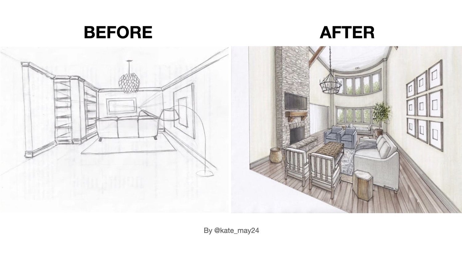
In this article, I'd like to underscore the significance of incorporating a value study into your interior drawings.

It's quite common to observe beginners using a pleasing colour palette for their sketches. However, a key aspect often overlooked is the variation in tones. Without a thoughtful value study, the sketch tends to appear flat and lacks the dynamic contrast that brings it to life.

The secret to enhancing your interior sketches lies in mastering the art of value study.

Sketching teaches us to become very observant, to see nuances.
— Olga Sorokina

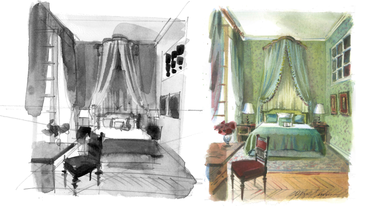
A “value study" in drawing refers to the exploration and representation of different shades of light and dark within an artwork. 

When it comes to interior drawing, understanding and effectively depicting values are crucial for creating a sense of depth, lighting, and atmosphere.


Here is a quick guide on how to approach a value study for interior drawing:

  • Identify Light Sources:

    • Determine the primary light sources within the interior space. This could be sunlight streaming through windows, artificial lighting from lamps, or a combination of both.

    • Note how the direction and intensity of light affect different surfaces and objects in the room.

  • Define Major Forms:

    • Identify the major forms and shapes within the interior, such as furniture, architectural elements, and decorative items.

    • Use values to accentuate the three-dimensional qualities of these forms. Consider how light and shadow play across surfaces.

  • Establish a Focal Point:

    • Decide on a focal point within the interior. This could be a specific area, object, or piece of furniture that you want to draw attention to.

    • Use a higher contrast around the focal points or key elements in the foreground, making it stand out within the composition. This not only directs attention but also adds to the perception of depth by making those elements visually prominent.

  • Consider Material and Texture:

    • Different materials and textures within an interior space will reflect light differently. Pay attention to how values can convey the characteristics of materials, such as the shine of polished surfaces or the softness of fabrics.

    • Experiment with variations in shading to depict a variety of textures realistically.

  • Balance Light and Shadow:

    • Achieve a balance between light and shadow to create a visually appealing composition. Avoid overly bright or dark areas unless intentional for artistic purposes.

    • Use mid-tones to connect light and shadow, allowing for smooth transitions and a cohesive overall look.

  • Utilize Reflections:

    • If there are reflective surfaces like mirrors or glossy furniture, consider how they interact with light sources and surrounding elements. Reflections can enrich your value study.

  • Experiment with Different Times of Day:

    • If possible, explore how the lighting changes throughout the day. Different times of day can significantly impact the mood and atmosphere of an interior space (think here “Haystacks” by Claude Monet).

    • Morning and evening light, for example, may create long shadows and warm tones, while midday light can be brighter and more direct.

  • Create Atmosphere:

    • Use values to establish the overall atmosphere of the interior. A well-executed value study can convey the mood of the space, whether it's cozy and intimate or spacious and airy.

  • Practice Depth and Perspective:

    • Use values to emphasize the sense of depth and perspective in the room. As objects or surfaces recede into the background, gradually decrease the intensity of values. Darker values in the foreground will contrast with lighter values in the distance, creating a sense of depth. Emphasize the contrast between light and shadow in the foreground. Remember that objects in the distance often have softer, less defined edges due to atmospheric effects.

  • Refine Details:

    • Pay attention to details in your interior drawing. Use values to highlight intricate details in furniture, patterns on surfaces, and other elements that contribute to the overall realism of the scene.


Remember that achieving depth and perspective in a value study requires a balance between accurate observation and artistic interpretation. Experimenting with these techniques will help you create interior drawings that not only capture the spatial relationships but also convey a convincing sense of depth through the effective use of values. Observe real interior spaces, study how light interacts with various elements, and practice consistently to enhance your skills in depicting values in interior drawings.


P.S. Hope you enjoyed this article, please share it on your social media so more Creatives can learn about the importance of value study and interior sketching.


© Olga Sorokina, 2024

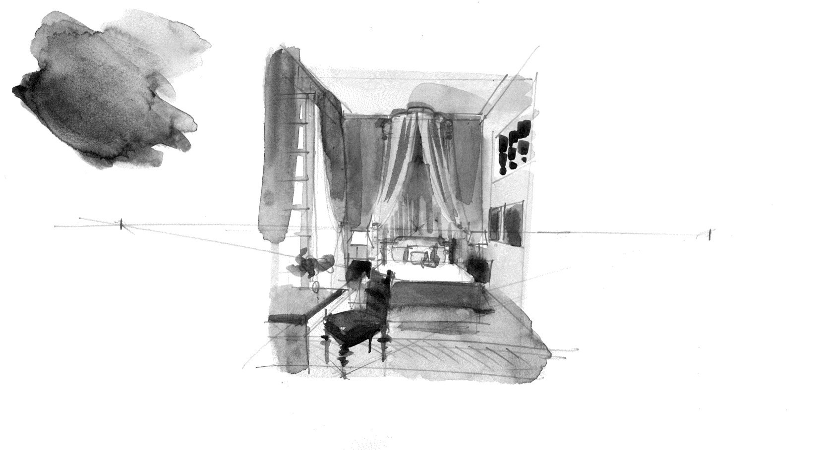
Drawings from my online course on watercolour techniques in interior sketching. Learn more here


Transform your interior drawings with depth and perspective in my online course “Interior Sketching in Watercolour“


See my blog archive: click here

Welcome to Sketching Retreat 2023: The #1 Online Event for Interior, Architecture, and Landscape Sketching

Are you passionate about sketching, perspective drawing, architecture, or interior design?

If so, you're in for a treat! Imagine having the opportunity to learn from your favourite instructors, artists, architects, and designers during a six-day online event that's absolutely free.

Welcome to Sketching Retreat 2023, the #1 online event in the field of interior, architecture, and landscape sketching!

This year, I will be teaching perspective drawing: “1-Point Perspective Made Easy: Sketching the Iconic Neuendorf House”. I can’t wait to see you on the inside!


What is Sketching Retreat 2023?

Sketching Retreat 2023 is a remarkable event that brings together creative minds from around the world to explore the art of sketching in various domains. This six-day online extravaganza is a treasure trove of more than 30 workshops, each tailored to enrich your knowledge and skills in architecture, interior design, and landscape sketching.


What Will You Learn from the Workshops?

At Sketching Retreat 2023, you'll immerse yourself in an abundance of knowledge and creativity. Some of the techniques and applications you'll master during the workshops include:


- Pen & Pencil Drawing: Unlock the secrets of creating intricate sketches with the simple tools of pen and pencil.

- Colour Markers: Explore the world of vibrant colors and learn how to bring life to your sketches.

- Watercolour Painting: Dive into the world of watercolors and transform your sketches into colorful masterpieces.

- Morpholio Trace: Discover the power of digital sketching with the Morpholio Trace app.

- Procreate: Unleash your creativity with the popular digital art app, Procreate.

- Concepts: Explore innovative sketching techniques and concepts that will elevate your skills to new heights.


These workshops will be led by a diverse array of instructors, including artists, architects, and designers, each offering their unique style, techniques, and mediums.


Meet the Host: David Drazil

Sketching Retreat 2023 is hosted by my friend, the talented David Drazil from sketchlikeanarchitect.com. David is architect, content creator, speaker, and book author. David's passion for sketching and design is incredible, and he brings a wealth of knowledge and experience to the event. I am sure, his expertise and vision will undoubtedly inspire all participants.


How to Register:

Don't miss out on this incredible opportunity to enhance your sketching skills and learn from some of the best in the industry. To register for Sketching Retreat 2023, simply follow this registration link:


Sketching Retreat 2023 is not just an event; it's an experience that has the potential to transform your creative journey. Whether you're a seasoned sketch artist or just beginning to explore the world of architecture, interior design, or landscape sketching, there's something here for everyone.

Embrace this opportunity, and join us at the #1 online event for sketching in 2023. Register today, and let's embark on this artistic adventure together. Unleash your creative potential like never before!

I can't wait to see you at Sketching Retreat 2023!

Olga Sorokina


Read other articles on my blog:

Watercolour Interior Drawing: Overcoming 3 Common Mistakes Beginners Make

Mastering Watercolor Interior Drawing:

Conquering 3 Common Beginner Mistakes


In this blog article, we will explore three common mistakes that beginner artists often make in watercolour, with a focus on interior sketching. By understanding these mistakes, you will gain valuable insights and learn how to avoid them. Additionally, we'll address the main fear beginners face and provide guidance on overcoming it. So, get ready for an enjoyable and inspiring read!


Watercolour - A Captivating Medium

The allure of watercolour lies in its ethereal qualities, its lightness, and the semi-transparency of colours. It can evoke various moods, from introspection and melancholy to vibrancy and joy. Watercolour resides on the boundary between drawing and painting, combining the best of both worlds. Even Leonardo da Vinci recognized its unique attributes and utilized it for his sketches.

Watercolour can be likened to an actress – spontaneous, free-flowing, and light, yet also capable of achieving balance and realism through techniques like glazing. It has captivated me and I consider it superior to other mediums such as oil, acrylic, tempera, pastel, and even markers.

Watercolor, a captivating actress, dances between chaos and serenity, embodying both untamed spontaneity and balanced realism.
— Olga Sorokina


Choosing Between Watercolour and Markers

A common question I receive is whether I prefer watercolour or markers. The answer depends on the purpose. Markers are excellent for quick interior sketches and are beginner-friendly due to their ease of use and control. They offer transparency and layering capabilities, similar to watercolours.

For travel and convenience, markers are my go-to choice. I always carry a couple in my bag for sketching on the go, whether in cafes, parks or during dance classes. However, when it comes to plein-air painting and more extensive academic drawings, watercolour excels. It is my preferred medium for courses like "Watercolour in Interior Sketching."

It is worth noting that my journey with watercolour began in childhood, whereas markers gained popularity relatively recently. So, consider your purpose and experience when selecting between these mediums.


Conquering the Fear of Water

One of the main fears beginners face in watercolour is the fear of water itself. The uncertainty of how to control water and achieve the right paint-water ratio can lead to frustration. However, it is essential not to let this fear discourage you. Let me share a valuable tip to help you befriend watercolour.

Embrace water and approach it with curiosity and openness. Fall in love with water! Often, beginners set high expectations for their initial watercolour attempts, and any setbacks can lead them to abandon the technique. Remember, nobody expects to effortlessly ride a bicycle without practice. Similarly, watercolour requires patience and practice.

Mistakes are not something to be avoided; they are gifts from the divine. Instead of striving for perfection, seek to understand your mistakes, learn from them, and grow. As Salvador Dali wisely said, "Mistake - a gift from the divine. Therefore, do not strive to correct your mistakes. Instead, try to understand them, delve into their meaning, endure them. And liberation shall follow."

 
Mistake is a gift from the divine. Therefore, do not strive to correct your mistakes. Instead, try to understand them, delve into their meaning, endure them. And liberation shall follow
— Salvador Dali
 

Drawing from my online course “Interior Sketching in Watercolour“


Let's Explore the Three Common Mistakes

Now, let's delve into the three common mistakes that often arise. By recognizing and addressing these mistakes, you can enhance your artistic abilities and improve your watercolour interior drawings.


Mistake #1: Fear of Water and Embracing Mistakes

This mistake stems precisely from the fear of water that I mentioned earlier. Let me emphasize that mistakes are wonderful! The more mistakes you make, the faster your growth and progress will be! It sounds strange, doesn't it? But consider this: the best way to learn something is to actually do it, isn't it? The same applies to watercolor. You just need to engage in regular practice without giving up at the first sign of failure. Embrace the process, let the colors flow if they wish to, and experiment fearlessly. Be open to making mistakes because you are learning! Find joy in the process, for you have embarked on watercolor to explore something new and infuse more creativity and happiness into your life. The most important thing is that through regular practice, you will reach a level where you can smile at your early works and see those mistakes, understanding that without them, you wouldn't have grown creatively. Art is a process, so enjoy it and stop judging yourself or constantly comparing yourself to others.


Mistake #2: The Colour Conundrum - Embracing the Artistic Sweet Spot

When it comes to colour, novice painters often find themselves caught in two extremes: oversimplification or overcomplication. The former group tends to rely on bright, unadulterated hues straight from the tube or palette, while the latter muddle their creations with an excessive mix of colours, resulting in muddy tones. These polar opposites can hinder your watercolour journey. But fear not, for there lies a glorious middle ground, a harmonious balance to be discovered.

In watercolour, finding the "golden mean" is paramount. It can be achieved by following two essential rules:

  1. "Don't settle for colours straight from the tube; instead, mix them on the palette" - this rule applies to those who tend to oversimplify, helping you infuse depth and nuance into your artwork.

  2. "Limit your palette to three or four colours at most" - this rule guides those who tend to overcomplicate, allowing you to maintain clarity and coherence in your creations.

By embracing this delicate equilibrium of colour, you unlock the true potential of watercolour and set your imagination free.


Mistake #3: The Power of Water - Embrace Its Essence

One common mistake arises from a fear of embracing water in watercolour. This fear can lead to artworks that resemble gouache or tempera paintings, lacking the translucency and vitality that watercolour is renowned for. When the paint is applied too heavily, the paper loses its breath, resulting in a lifeless piece that yearns for the touch of water's magic. Remember, watercolour is the embodiment of its name, a celebration of water's fluidity and grace.

Let go of your inhibitions and allow the water to dance upon your canvas. Embrace its essence and infuse your artwork with life, air, and vibrancy. Grant yourself the freedom to explore the boundless possibilities that watercolour offers.

Now I'm eager to hear your thoughts: Have you encountered these mistakes and fears in your artistic journey? Do you recognize them in your own work? How does working with watercolour make you feel? Have you ventured into its captivating realm before? Share your experiences and insights in the comments below!


P.S. If this blog post has ignited your creative spirit and provided valuable insights, please spread the inspiration by sharing it with your fellow artists and friends on social media. Let's embark on this artistic adventure together! Thank you!


© Olga Sorokina, 2023


Check out the program and sketches from my online course 'Interior Sketching in Watercolor'